No no, it's not a typo, it's just a bad pun :D
I'm here to tell you that I am Marie-France and I am an addict!
For the past 7 years, I have been collecting fonts like a maniac. I use a very small portion of them, most just take up room on my hard drive, a bunch of them look like each other,
but I can't help myself... lol
I know some people out there believe that fonts should be limited to Times New Roman, Helvetica and Arial. For some, it's even a pet peeve. I agree that for formal writing, like published work or work related documents, that's preferable.
I however, do not see the harm in a teacher using a fun font on an assignment instruction paper, even if it is Comic Sans Serif!! That's right, I said it, and I've used it!
In digital scrapbooking, I think a collection of fun fonts is not only okay, it's a must! Varied, original fonts make titling your layout easier and more interesting, and if you journal at all, while a typewriter style font can look good on some layouts, I think it might get a little boring if used on every single one. For that, a variety of fonts, especially some handwritten type fonts, is great!
Let me show you some of my favourite layouts using fonts as a tool to add interest:

Here I used three alphas combined with two fonts for the title, and a third font for journaling.

Here, I didn't want to use the alpha for the entire title, which would have been too long, but as the second part of the title is right above the journaling, I used a fun font for the second half of the title and another handwritten one for the journaling.
Here, I wanted the title to be simple and not stand out to much, so an alpha with shadows would have been too much, so I chose a font, but a fun one that matched the theme of the page.
I go a little further than that though...
I like to make myself happy with little details that don't matter in life. Little things like matching my socks to my top, or using a cute mug, or placing things in rainbow order.
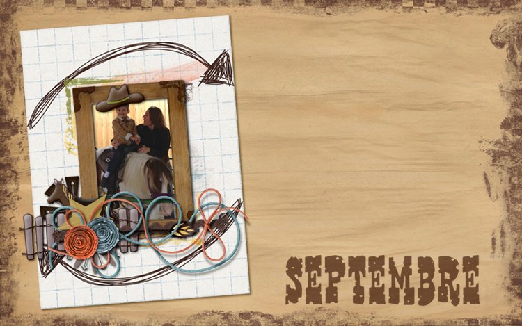
Well, I sometimes kind of do that with fonts. If a page has a clear theme, I match the font to that (like a Western font for a cowboy themed page like above), but if the page does not really have a cultural or geographical theme, I try to match the name of the font...
Let me give you examples so you can understand the madness, lol
I like to make myself happy with little details that don't matter in life. Little things like matching my socks to my top, or using a cute mug, or placing things in rainbow order.
Well, I sometimes kind of do that with fonts. If a page has a clear theme, I match the font to that (like a Western font for a cowboy themed page like above), but if the page does not really have a cultural or geographical theme, I try to match the name of the font...
Let me give you examples so you can understand the madness, lol
If the page features pancakes, or a family brunch, I use a font called Second Breakfast. If the page shows my little guy in his snow suit, I might use Canadian Penguin, and if on the other hand he's wearing his raincoat, I'll use Grenouille (which is frog in French). If I'm quoting Antoine de St Exupéry (a famous author and aviator), I use Santos Dumont (the name of another aviator). I'm pretty sure nobody every notices (especially as I am really bad and never credit my fonts) but it makes me happy :D
Now, the only hard part, which limits my font collection and choice when journaling, is being French! There are many many many fonts out there, but only a small portion include accented letters :(
So when I'm doing a page in French, which I have done more and more of for my son's sake, I have to take that into account. I used to type a comma or an apostrophe and manually go add accents on letters. Seriously! It took forever and sometimes didn't look great... But the little guy used to nap for hours and go to bed early, lol. Now he sleeps a lot less and I work more and I just don't have the time for it. So I choose from the accented fonts available out there. I've also never paid for a font as there are soooo many awesome free ones out there. And therefore, I want to share the name of my two favourite font designers. One if from Québec and therefore naturally includes French accents. I don't think she creates anymore, but I love the few fonts she's made. Her designer name is Jellyka Nereva and you can see her fonts here on Dafont.
The other one is Darcy Baldwin, who does not have any reason to include accents, except for being awesome! Here's the amazingly long list of DJB fonts with euro letters.
I'll conclude with a couple of the fonts I use most often. If I don't have time to think about it and I just want a cute, accented, easy to read, handwritten font, I pick either DJB Geeks Who Wear Glasses or Aint Nothing Fancy. They are my go-to fonts!
What are your favourite fonts?


1 comments:
Like usual you have outdone yourself Marie France.....love it
Post a Comment